Part-to-whole Chick-Fil-A Menu Items
dataviz
chart-challenge
TIL
#30DayChartChallenge Day 1
Quick primer on the #30DayChartChallenge
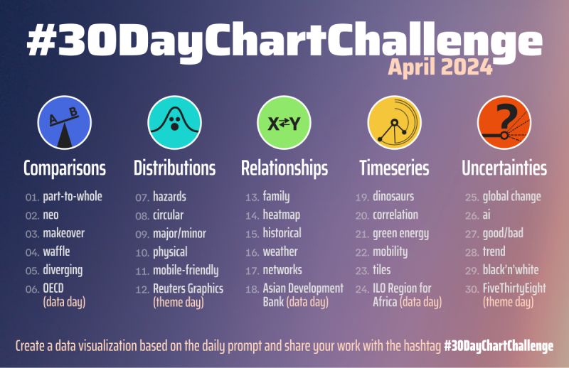
The #30DayChartChallenge is a data visualisation community activity that I found out via Linkedin. Every day for the month of April 2024 has a key word prompt (see image above). For each prompt, participants all around the world come up with an original data visualisation to share.
On a whim, I decided to participate in this challenge as I think it’s a great way try something new, better understand my tools and engage with a vibrant community.
Given that this is very much a last-minute decision, I’ll choose to use Python libraries that I am familiar with. polars has already completely replaced pandas for my data manipulation needs and lets-plot is one of my favourite ggplot2 ports in Python.
Data Prep
I have heard rumours of Chick-Fil-A looking to open it’s 1st outlet in Singapore (source), so I was inspired to make a visualisation to show the component parts of the major macro-nutrients - Protein, Carbohydrates and Fat for its popular menu items. I figure this should help me decide what I should spend my calories on when it first opens 😋.
It took a bit of a search, but as always TidyTuesdays has a suitable dataset for my needs.
I planned to create a stacked bar chart so we need to manipulate the dataframe into a tidy-longer form.
Nutrients in Chick-fil-a menu items
![]()
Code
from lets_plot.mapping import as_discrete

p = (ggplot(chick_fil_a)
    + geom_bar(
        aes(
            x=as_discrete('item', order_by='value', order=1),
            y="value",fill="Nutrients"),
            stat="identity"
        )
    + coord_flip()
    + labs(
        x= "",
        y = "Nutrients (g)",
        fill= "",
        caption = "Data: TidyTuesday 2018-09-04\nMade by: www.ddanieltan.com"
        )
    + theme_minimal2()
    + scale_fill_manual({'Protein':'#3b3561','Carbohydrates':'#E51636', 'Fat':'#ffc759'})
    + theme(
        legend_position="bottom",
        plot_caption=element_text(size=12, color='grey'),
        plot_margin=[20,50,10,0]
    )
)

p
Things I Learnt
- Lets-plot has a unique method
as_discrete()to reorder categorical values, analogous toreorder()inggplot2Docs - It’s really difficult to move my plot title to the left-margin of the plot instead of the axis due to the lack of a parameter like
ggplot2’splot.title.positionbut it’s coming soon https://github.com/JetBrains/lets-plot/issues/1027
Reuse
Citation
BibTeX citation:
@online{tan2024,
  author = {Tan, Daniel},
  title = {Part-to-Whole {Chick-Fil-A} {Menu} {Items}},
  date = {2024-04-01},
  url = {https://www.ddanieltan.com/posts/30-day-chart-1},
  langid = {en}
}
For attribution, please cite this work as:
Tan, Daniel. 2024. “Part-to-Whole Chick-Fil-A Menu Items.”
April 1, 2024. https://www.ddanieltan.com/posts/30-day-chart-1.