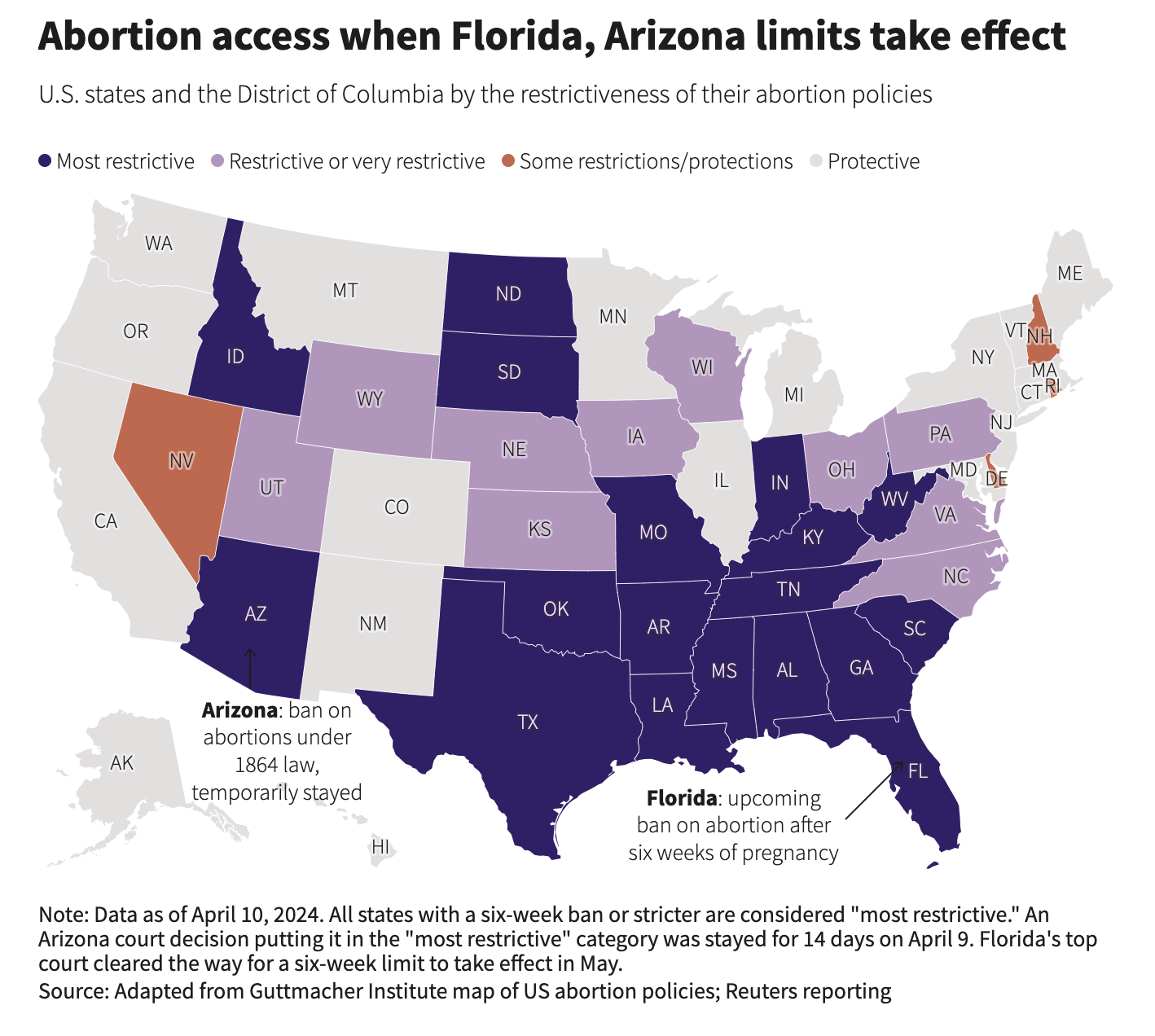
I am back from my break and I’m looking forward to squeeze in another #30DaysChartChallenge. Today’s theme is Reuters, so I browsed excellent graphics section and found this article which featured this chart.
I was excited to attempt to mimic this chart because I was very keen on learning how to work with geographical data and visualize maps. Lets-Plot proved to be an excellent library for this type of visualisation.
import pandas as pdimport geopandas as gpdfrom lets_plot import*from lets_plot.geo_data import*LetsPlot.setup_html()states = geocode_states().countries('US-48').inc_res().get_boundaries()reuters = pd.read_csv('./reuters_abortion_access.csv')df = states.merge(reuters, on='state')# Adding abortion access data based from https://www.reuters.com/graphics/USA-ABORTION/DISTANCE/jnvwxorwkpw/p = (ggplot()+ geom_map(aes(fill='access'), data=df, color='white')+ scale_fill_manual( values = ['#e3dfdf','#c96448','#321f6a','#b695bf'], labels = ['Protective','Some restrictions/protections','Most restrictive','Restrictive or very restrictive'] )+ ggsize(width=700,height=600)+ labs( title ='Abortion access when Florida, Arizona limits take effect', subtitle ='U.S. states and the District of Columbia by the restrictiveness of their abortion policies', caption ='#30DayChartChallenge #Day12 Reuters\nData: Reuters Graphics\nMade by: www.ddanieltan.com' ) + theme_minimal()+ theme( legend_position='top', legend_text = element_text(size=12), legend_title = element_blank(), plot_caption=element_text(size=12, color='grey'), plot_title=element_text(size=20, face='bold'), axis=element_blank(), panel_grid = element_blank(), ))p
I am really happy with how my attempt came out, even though it’s not a perfect replica. Going through this process, I am more aware of subtleties such as the choice of projection, the availability of text labels and usefulness of annotations that go into making a good map. Looking forward for more practise in the future!