Code
This post is my contribution to this year’s #30DayChartChallenge. Check out my Day 1 post to learn more.
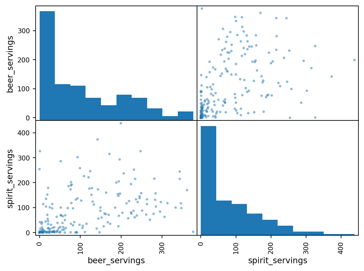
Makeover day has arrived, folks! Time to dust off those old relics from the ancient data catacombs and give them a fresh coat of paint. Today’s lucky candidate? A vintage scatter matrix plot taken from an introductory Data Science course I took many years ago.
The original scatter matrix plot, seen in the “Before” image, uses both histograms and scatter plots in a 4 panel chart to highlight the relationship between pairs of numerical variables. I would like to have a go at sprucing this chart up to make the insight the chart wants to share clearer.
from lets_plot import *
from lets_plot.bistro.joint import *
LetsPlot.setup_html()

drinks['continent'] = drinks['continent'].replace({
    'AS' : 'Asia',
    'EU' : 'Europe',
    'AF' : 'Africa',
    'NAm' : "North America",
    "SA" : "South America",
    "OC": "Oceania"
})

(
    joint_plot(
        data=drinks,
        x='beer_servings',
        y='spirit_servings',
        color_by='continent',
        reg_line = False
        )
    + theme_minimal2()
    + labs(
        title = 'Distribution of average Beer vs Spirit servings across Continents',
        x = 'Beer Servings',
        y = 'Spirit Servings',
        caption = '#30DayChartChallenge #Day3 Makeover\nData: General Assembly DS Course\nMade by: www.ddanieltan.com'

    )
    + theme(
        legend_position='top',
        plot_caption=element_text(size=12, color='grey'),
        plot_title=element_text(size=18,),
    )
    + scale_color_brewer(palette='Dark2', guide=guide_legend(nrow=2))
    + ggsize(width=700,height=600)
)guides layer for Lets-Plot, although for today’s plot, I decided to pass my guide param into the scale layer for brevity documentation@online{tan2024,
author = {Tan, Daniel},
title = {Makeover},
date = {2024-04-03},
url = {https://www.ddanieltan.com/posts/30-day-chart-3},
langid = {en}
}